Introduction
If you're learning front-end development, building real projects is one of the best ways to improve your
skills. Instead of practicing isolated concepts, projects help you understand how HTML, CSS, and
JavaScript work together to create complete user experiences.
In this tutorial, we'll build a
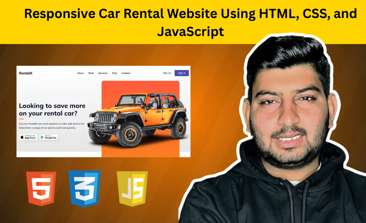
responsive car rental website called RentalX using HTML, CSS, and JavaScript. The project has a modern
design, works smoothly on different screen sizes, and includes interactive elements that improve the
overall user experience.
Whether you're creating projects for your portfolio or simply
practicing your coding skills, this beginner-friendly project is a great addition to your learning
journey.
Why Build This Project?
Many beginners know the basics of HTML and CSS but struggle to create websites that look professional.
This project bridges that gap by introducing practical concepts used in real websites.
By
completing this project, you will learn how to:
- tructure a multi-section landing page
- Create responsive layouts for different devices
- Build a mobile-friendly navigation menu
- Use CSS variables for maintainable styling
- Add smooth animations using JavaScript
- Organize code in separate files
- Improve user experience with interactive elements
These are valuable skills that employers and clients expect from front-end developers. Before we dive into the code, let's take a quick look at the features that make this project stand out.
Features of the RentalX Website
This project is more than just a static landing page. It includes several features commonly found in modern websites.
Responsive Navigation
The website features a navigation bar that adjusts based on screen size. On smaller devices, users can access the menu using a menu button.
Attractive Hero Section
The hero section introduces the RentalX platform with a compelling heading, supporting text, and download buttons.
Rental Process Section
Users can quickly understand how the rental process works through easy-to-follow steps.
Services Section
This area highlights the benefits offered by the platform, such as affordable pricing and customer support.
Customer Experience Section
Different service advantages are displayed in visually appealing cards.
Download Section
Visitors are encouraged to download the mobile application through dedicated app store buttons.
Smooth Scroll Animations
ScrollReveal animations make the website feel more modern without affecting performance. Now that we understand what we're building, let's start with the backbone of every website: the HTML structure.
HTML
HTML acts as the foundation of the entire website. It organizes the content into meaningful sections that
are easy to understand and maintain.
The navigation links connect users to different parts of
the page.
                  <ul class="nav__links" id="nav-links">
  <li><a href="#home">Home</a></li>
  <li><a href="#rent">Rent</a></li>
  <li><a href="#service">Services</a></li>
  <li><a href="#ride">Ride</a></li>
  <li><a href="#contact">Contact</a></li>
  <li class="nav__links__btn">
    <button class="btn">Sign Up</button>
  </li>
  <li class="nav__links__btn">
    <button class="btn">Sign In</button>
  </li>
</ul>
Each section of the page is wrapped inside dedicated containers, making the structure clean and easy to
navigate.
For example, the website includes sections for:
- Home
- Rent
- Services
- Ride Experience
- Contact
- Footer
Breaking content into sections also improves readability and makes future updates easier. A well-organized HTML structure becomes especially important as projects grow in size.
Once the structure is ready, it's time to transform plain content into an engaging design.
CSS
After building the structure, CSS is used to transform plain HTML into an attractive interface.
One of the best practices used in this project is defining reusable CSS variables.
:root {
  --primary-color: #fe5b3e;
  --text-dark: #0f172a;
  --text-light: #475569;
  --extra-light: #f2f2f2;
  --white: #ffffff;
  --max-width: 1200px;
  --gradient: linear-gradient(to bottom, #fe5c3c, #fc8023);
}
Using variables provides consistency throughout the design. If you decide to change the website colors
later, you only need to update them in one place.
Buttons are another important part of the user
interface. The project styles them using the following code:
.btn {
  padding: 0.75rem 1.5rem;
  outline: none;
  border: none;
  font-size: 1rem;
  color: var(--white);
  background-color: #474fa0;
  white-space: nowrap;
  border-radius: 4px;
  transition: 0.3s;
  cursor: pointer;
}
Hover effects and transitions improve the visual feedback users receive when interacting with elements.
The project also uses media queries to ensure the layout adapts beautifully across desktops,
tablets, and mobile devices. Responsive design is no longer optional because a large percentage of users
browse websites from smartphones.
Of course, great design alone isn't enough. Users also expect
websites to respond to their actions, which is where JavaScript becomes essential.
JavaScript
JavaScript brings interactivity to the website.
The first interactive feature is the mobile
navigation menu. Instead of displaying all links on small screens, users can open and close the menu
when needed.
const menuBtn = document.getElementById("menu-btn");
const navLinks = document.getElementById("nav-links");
const menuBtnIcon = menuBtn.querySelector("i");

menuBtn.addEventListener("click", (e) => {
  navLinks.classList.toggle("open");

  const isOpen = navLinks.classList.contains("open");
  menuBtnIcon.setAttribute("class", isOpen ? "ri-close-line" : "ri-menu-line");
});
This functionality enhances usability and keeps the interface uncluttered.
The project also
closes the menu automatically when users select a navigation link, creating a smoother mobile
experience. Small details like these often make the difference between an average website and a polished
one. Another subtle enhancement in this project comes from animation.
Creating Scroll Animations
Animations can make websites feel more engaging when used carefully.
This project uses
ScrollReveal to animate elements as they appear on the screen. The animation settings are defined as
follows:
const scrollRevealOption = {
  distance: "50px",
  origin: "bottom",
  duration: 1000,
};
These settings control how elements move and how long the animations take.
The step cards are animated using this code:
ScrollReveal().reveal(".steps__card", {
  ...scrollRevealOption,
  interval: 500,
});
After understanding how the project works, you can also experiment with additional features to make it your own.
Ideas to Customize This Project
Once you understand how the project works, try adding your own improvements. Some ideas include:
- Adding a booking form
- Integrating a backend database
- Displaying available cars dynamically
- Including customer testimonials
- Adding dark mode support
- Connecting authentication systems
- Creating separate pages for car listings
These additions can help transform a simple tutorial project into a complete portfolio piece. They also provide opportunities to explore new technologies and expand your skill set.
Conclusion
The RentalX project is a simple yet powerful way to practice front-end development. By combining HTML, CSS, and JavaScript, you've built a responsive website that feels modern and user-friendly.
This project gives you hands-on experience with real-world concepts like responsive layouts, smooth animations, and clean code organization. Once you've mastered the basics, you can expand it with features like booking forms, car listings, or dark mode to make it even more impressive.
Source Code